
A lot of folks can make decisions about what to them is “pretty” or “attractive”, but a pretty blog that is impossible to read, navigate or use is worthless. Function > form. Especially on the web. So today, instead of giving you tips on styles, colors or fonts (which is individual to each person), I’m going to give you functional usability design tips. These are the kinds of things anyone can implement. And everyone should. So, let’s do it!
1. Left align your text, just do it.
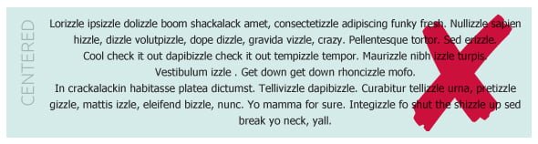
The offending blog I mentioned earlier? I couldn’t get through the content because the text was centered. It made it almost painful to read. Just say no to centered text. Centered text is for headlines, billboards and advertisements—not for large chunks of text. Why? Well, each time your eye moves to a new line, it has to struggle to find the start (because it’s never in the same spot twice), which makes it uncomfortable to read large chunks of text. It just isn’t a smooth transition between lines. Just go ahead and left-align your text. I promise you that users aren’t comprehending your content well if your text is centered. If you want users to read—and understand—your content, don’t center it.
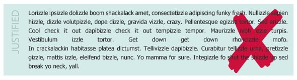
Think fully justifying your text is a good compromise? Think again. Justified text is better than centered, but justified text has its own problems—especially on the web. First of all, a reader uses the right length of a line to help them identify where they are in a paragraph. It all happens in a few milliseconds, but basically, a reader sees “Oh, that line is longer than the one above it and the one below it, so don’t read that one again.” but when all the lines are the same length, it’s nearly impossible to identify where you are in the paragraph. Justified text means re-reading the same line multiple times, which we all know can be frustrating. Also, to make text justified spaces are put between words, which causes “rivers” (areas of white that flow throughout the paragraph) which disrupts the reader.
In print, designers have more control over how text is justified. They can tweak and adjust things to make it to where rivers don’t show, but on the web, you have almost no control over that.
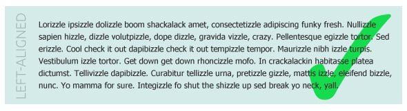
Seriously, just left align it. There has been decades of typography research done about this (yes, there are researchers that cover such things)—flush left text with ragged right lines are the easiest to read and score the highest when it comes to reading comprehension. If you want your readers to consume large amounts of text (like say, a 1600 word blog post, like this one) you want to make it as easy as possible on them to read it and understand it, dontcha?
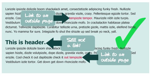
2. Make your links all the same color. And only use that color for links.
When we’re surfing the web, we are constantly looking for indication that something is clickable. This is really clear when something is a big fat button or says “click here” but it gets a little fuzzy when it’s just a link inside a swath of text (like this). Most websites use color to indicate links in text. My link color is a hot pink color. Awesome! It stands out from the black non-link text and obviously has a different purpose. The problem comes when people use their link color for other text that isn’t a link.
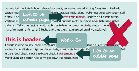
So say you’re link text is bright red. A reader is reading a blog post, sees a bright red word, clicks on it, gets sent to another website, comes back. Then they keep reading. They see another bright red word, click it and the same thing happens—they go to a link. But when they come back to your blog, they see a headline that is the same bright red color. What are they going to expect that header to do? Link to something. But when they try to click on it, nothing happens, because it isn’t a link. And suddenly, your reader has hit a hiccup. You created a precedent that bright red=link. But when you used that red elsewhere without the same action, confusion hit. So pick a link color and only use that color on links.
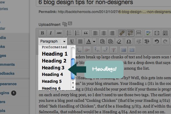
3. Use headers.
Headers are good. Headers break up large chunks of text and help users scan to find the information they need. Don’t know how to apply a header? In your blog editor visual view, look for a drop down that says “Paragraph” or “Style”. Open it up and inside you should see Heading 1, Heading 2, Heading 3, etc. among the list.
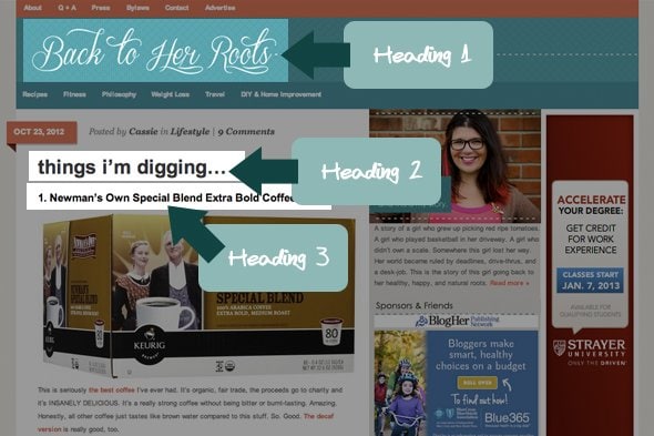
You should never use Heading 1 or Heading 2. Why? Well, this gets into semantic HTML code geeky-stuff, but to boil it down, those are already “taken” in your blog structure. Your Heading 1 (H1 in the code) is the title of your blog (so Wholefully is mine) and your Heading 2 (H2) should be your post title if your theme is programmed properly. Those are automatically generated on each and every blog post, so you don’t need to use those two tags.
The earliest header your blog post could use is Heading 3. So say you have a blog post called “Cooking Chicken” (that’d be your Heading 2/H2) and then inside that blog post you have a section titled “Safe Handling of Chicken”, that’d be a Heading 3/H3. And if within that section, you have a sub-section specifically about Salmonella, that subhead would be a Heading 4/H4. And so on and so on.
Don’t just pick your headings based on the color/size/how they look—the heading tags are literally altering the document structure of your blog post. Want to read more about it? Here’s a good resource.
4. Keep your line lengths reasonable.
As widescreen monitors become more popular, I’m seeing more and more blogs with super long line length (the number of characters on one line before it breaks). Just like with the centered text, super long line lengths are difficult to read because you lose your spot. You spend so much time reading a single line, that by the time you are ready to jump back and read the next line, you have to pause and find your spot. No bueno.
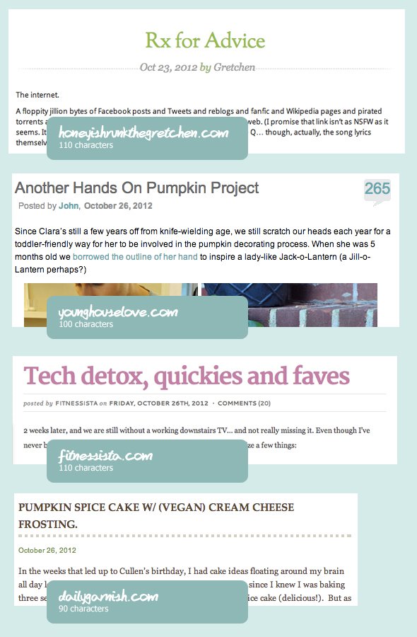
It’s generally accepted that a good web line length is around 100 characters (that includes spaces) but I’d say you could even go up to 130ish and still be good. Basically anything way short (under 50) or way long (over 150) is going to cause some issues. Go ahead, count your characters. Here are some examples of blogs out there with excellent line lengths:
5. Short paragraphs are king.
This blog post is a terrible example of this (do as I say, not as I do), but short paragraphs are king on the web. TL;DR, anyone? That doesn’t come from the word count, that comes from the wall-of-text that comes from not using frequent paragraph breaks. There is something so intimidating about a giant paragraph on the web. Breaks are good. I usually write my post, with my normal paragraph-when-I’m-feelin’–it method and then go back and try to add more paragraph breaks wherever I can.

6. Skip serif font for body text.
Any trained designer can tell you that serif fonts (fonts with the little tails on the tops and ends of their letters) are the absolute best for readability when it comes to print text, because the eye carries between letters easier. But on the web? Not so much. Sans serif fonts reign supreme. Why? Well, the pixels of the computer monitor screen actually break up the serifs, which makes fonts like Georgia and Times New Roman look fuzzy when at a small, body-text size. But sans serifs like Arial and Tahoma look crisp and clean. If you love a good fancy serif, use it, but reserve it for larger header text where the serifs aren’t as easily broken up by the pixels of a screen.
Even if you don’t love the design of your blog (the colors, fonts, layout), if you implement these six suggestions, your blog will be so much more comfortable for your reader to consume your content—and that’s the whole point!
A usable, well-functioning blog combined with good content is definitely the cornerstone to becoming a successful blogger. Sure, people love a pretty website, but some of the most read blogs on the web focus a lot more on functionality and usability than they do making their blog pretty. Focus on these tips first, then go pick yourself out a new header photo.